http://lib.westfield.ma.edu/censusaff.htm
A classed choropleth map is a thematic map where coloring or shading are used to
the measurement of a statistical variable(s) being displayed on a map. In this classed
choropleth map, shading is used based on median age.
Sunday, July 22, 2012
Lorenz Curve Graph Map
http://www.unc.edu/depts/econ/byrns_web/Economicae/Figures/Lorenz.htm
Here is an example of a Lorenz Curve graph, which is created by plotting the cumulative distribution of a variable against its' frequency. They are used a lot in economic studies to show distribution and inequality in wealth or income.
Bilateral Graph Map
http://www.theatlantic.com/international/archive/2010/10/china-and-international-rules-self-interested-or-malign/64747/
A bilateral graph shows two more data sets within the same graph. Here is an example of such which shows trade statistics between the U.S. and China.
A bilateral graph shows two more data sets within the same graph. Here is an example of such which shows trade statistics between the U.S. and China.
Population Profile Map
http://www.ifad.org/operations/regional/pf/aids_1.htm
A population profile shows the number of individuals within an area (population) as a function of their ages. Here is an example of such, showing the projected number of individuals with and without AIDS in Botswana, Africa by 2020.
A population profile shows the number of individuals within an area (population) as a function of their ages. Here is an example of such, showing the projected number of individuals with and without AIDS in Botswana, Africa by 2020.
Scatterplot Map
http://www.stat.yale.edu/Courses/1997-98/101/scatter.htm
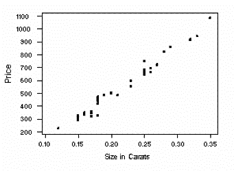
A scatterplot is graphical representation which uses the Cartesian coordinate system to show two sets of variables. Here is an example of such showing the size of diamonds in carats and their price.
A scatterplot is graphical representation which uses the Cartesian coordinate system to show two sets of variables. Here is an example of such showing the size of diamonds in carats and their price.
Index Value Plot Map
http://envstudies.brown.edu/oldsite/Web/special%20reports/Classes/ES201/2000/Drought%20Management/D%20-%20Indicators/indices%20with%20data/PDI/index%20value%20graph.html
An index value plot is a type of visualization map where an index value (not absolute value) is plotted on a line graph. This is used a lot within the stock market, to show the drop or rise of a stock or investment.
An index value plot is a type of visualization map where an index value (not absolute value) is plotted on a line graph. This is used a lot within the stock market, to show the drop or rise of a stock or investment.
Correlation Matrix Map
http://www.psychstat.missouristate.edu/multibook/mlt06m.html
A correlation matrix is a way to show the relationship(s) between data sets. Here is an example of such, which shows the success of students in graduate school based on multiple data and variables (intellectual ability, work ethic etc).
A correlation matrix is a way to show the relationship(s) between data sets. Here is an example of such, which shows the success of students in graduate school based on multiple data and variables (intellectual ability, work ethic etc).
Similarity Matrix Map
http://www-scf.usc.edu/~ise575/a/projects/shiu/website/
A similarity matrix is a graphical way to show how similar two data points are to one another. Here is an example of a similarity matrix of the Beatles' song "Hey Jude" using audio data.
A similarity matrix is a graphical way to show how similar two data points are to one another. Here is an example of a similarity matrix of the Beatles' song "Hey Jude" using audio data.
Parallel Coordinate Graph Map
http://www.ats.ucla.edu/stat/mult_pkg/perspective/v18n2p15.htm
A parallel coordinate graph is another way to show multivariate information in graphical representation. Here is an example of a parallel coordinate graph, showing earthquake data.
A parallel coordinate graph is another way to show multivariate information in graphical representation. Here is an example of a parallel coordinate graph, showing earthquake data.
Triangular Plot Map
http://www.ex-parrot.com/~chris/wwwitter/20050407-it_doesnt_matter_how_you_vote_either_way_your_planet_is_doomed.html
A triangular plot is a graphical representation technique that can be used when there are three variables to display. Here is an example of such, which shows the percentage of liberal democrat, labour, and conservative votes in the United Kingdom from 2005.
A triangular plot is a graphical representation technique that can be used when there are three variables to display. Here is an example of such, which shows the percentage of liberal democrat, labour, and conservative votes in the United Kingdom from 2005.
Climograph Map
https://mynasadata.larc.nasa.gov/preview_lesson.php?&passid=74
A climograph shows basic climate information, such as temperature, precipitation etc, for a specific area in a graphical format. This is an example of such, showing both average temperature and precipitation for Guam over a period of a year.
A climograph shows basic climate information, such as temperature, precipitation etc, for a specific area in a graphical format. This is an example of such, showing both average temperature and precipitation for Guam over a period of a year.
Histogram Map
http://www.math.kent.edu/~honli/teaching/statistics/Chapter2/Excell_Histogram.html
A histogram is a graphical display of the distribution numerical or statistical information, typically using bars of different heights. Histograms differ from bar graphs as histograms use number ranges. Here is an example of a histogram, showing the frequency distribution of height among 25 students.
A histogram is a graphical display of the distribution numerical or statistical information, typically using bars of different heights. Histograms differ from bar graphs as histograms use number ranges. Here is an example of a histogram, showing the frequency distribution of height among 25 students.
Box Plot Map
http://www.physics.csbsju.edu/stats/box2.html
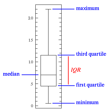
Here is an example of a box plot which is a way to show numerical or statistical information in agraphical manner, through the use of five number summaries: sample minimum, lower quartile, median, upper quartile and sample maximum. It may also include any outliers, if any.
Here is an example of a box plot which is a way to show numerical or statistical information in agraphical manner, through the use of five number summaries: sample minimum, lower quartile, median, upper quartile and sample maximum. It may also include any outliers, if any.
Stem and Leaf Plot Map
http://mainland.cctt.org/mathsummer/josephbond/stemandplots/stem-and-leaf_std.htm
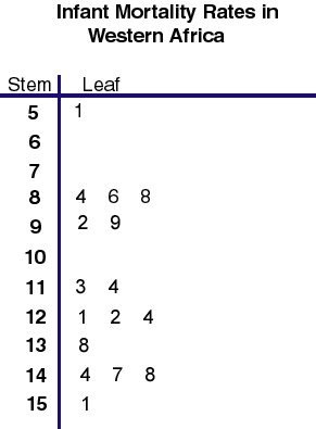
Here is an example of a steam and leaf plot, which is a way to show quantitative or statistical date in a graphical format. It typically has two columns separated by a vertical line; the left column contains the steams and the right column contains the leaves. This one is showing infant mortality rates in West Africa.
Here is an example of a steam and leaf plot, which is a way to show quantitative or statistical date in a graphical format. It typically has two columns separated by a vertical line; the left column contains the steams and the right column contains the leaves. This one is showing infant mortality rates in West Africa.
Star Plot Map
http://office.microsoft.com/en-us/excel-help/present-your-data-in-a-radar-chart-HA010218672.aspx
Here is an example of a star plot map, which is a way to show multivariate information on a 2-dimensional map. This map shows garden center sells of items for a given year.
Here is an example of a star plot map, which is a way to show multivariate information on a 2-dimensional map. This map shows garden center sells of items for a given year.
Tuesday, July 17, 2012
Statistical Map
http://personalpages.manchester.ac.uk/staff/m.dodge/cybergeography/atlas/census.html
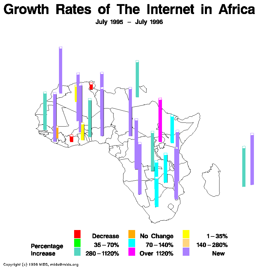
A statistical map shows variation in specific factor(s) for a given an area. Here is an example of such, showing the growth rates of internet use in Africa between 1995 and 1996.
A statistical map shows variation in specific factor(s) for a given an area. Here is an example of such, showing the growth rates of internet use in Africa between 1995 and 1996.
Cartographic Animation Map
A cartographic animation is a map that used animation to change in motion and/or time for the information within the map. This is used frequently in weather broadcasts, to show the movement of storms (i.e. hurricanes) over time and distance. Here is an example of a cartographic animation, showing the rebuilding of the Pentagon from 2001 to 2005.
Cartogram Map
http://politicalmaps.org/2004-presidential-election-maps/
A cartogram is a map that distorts area and/or distance in order to show some information or variable. Here is an example of a population cartogram which shows the 2004 US presidential election results.
Flow Map
http://www.mundi.net/maps/maps_014/index.html#telegeography
A flow map is one that shows the movement of a variable from one place to another. This flow map shows the traffic flow in Europe.
Propaganda Map
http://kuoest.wordpress.com/2008/10/19/the-world-according-to-rr/
A propaganda map is a map that shows distorted or incorrect information for political or other purposes. Here is an example of such a map, showing political views according to Ronald Reagan during the Cold War era.
A propaganda map is a map that shows distorted or incorrect information for political or other purposes. Here is an example of such a map, showing political views according to Ronald Reagan during the Cold War era.
Monday, July 16, 2012
DOQQ Map
http://www.geospectra.net/kite/kahola/kahola.htm
DOQQ stands for digital orthophoto quarter quadrangle...an aerial or satellite image is corrected for distortion. The US Geological Survey (USGS) uses this a lot. This is a DOQQ image of Lake Kahola, Kansas.
DEM Map
http://nsidc.org/data/docs/daac/nsidc0304_0305_glas_dems.gd.html
DEM stands for digital elevation model...a DEM map is a 3D representation of a terrain's surface. This is a DEM map of Antarctica.
DLG Map
http://www.outintheboonies.com/Tosohatchee/
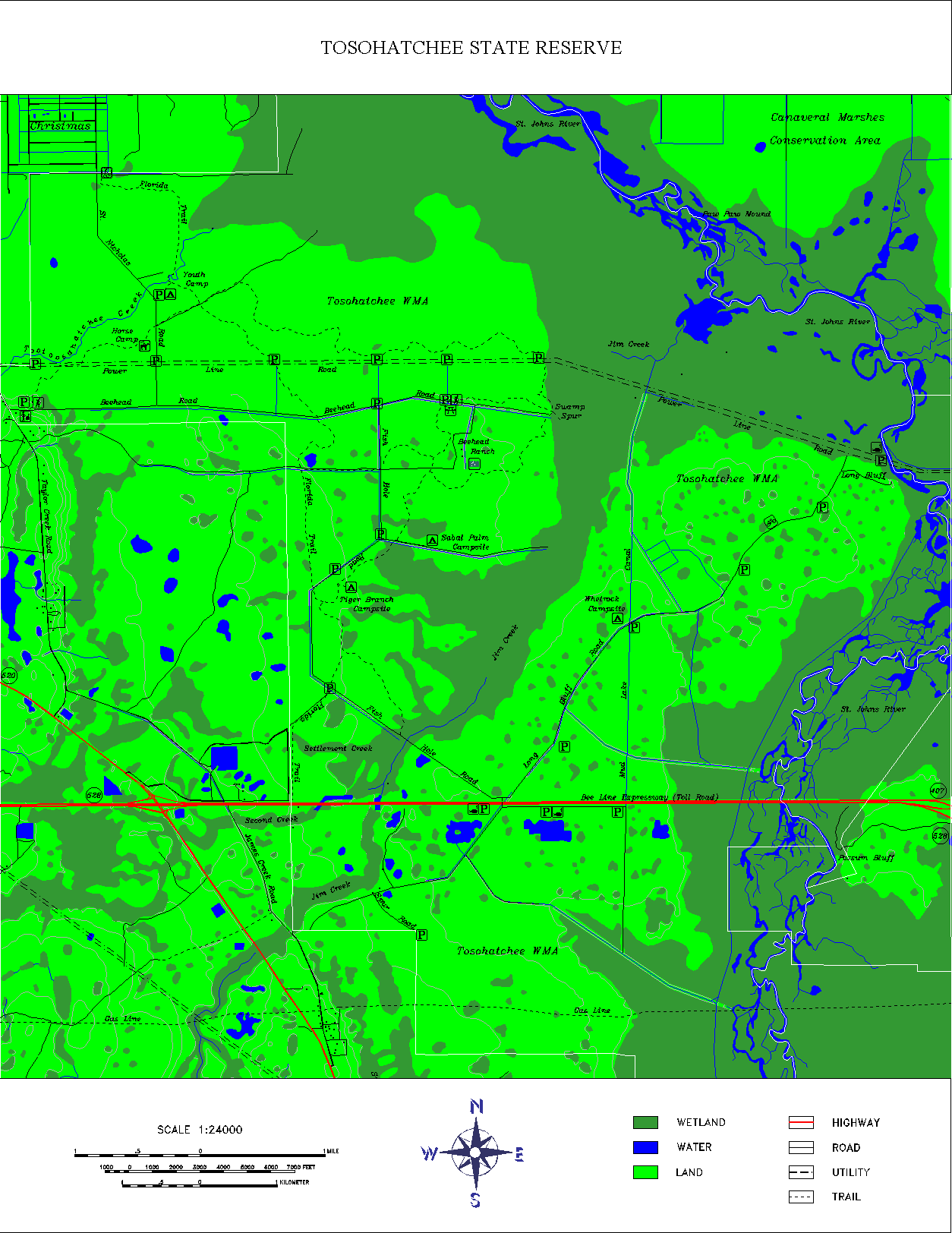
DLG stands for digital line graph...these types of map use digital vectoring to show information from US Geological Survey (USGS) maps. This is a map of the Tosohatchee Wildlife Management Area in Florida and uses DLG data.
DLG stands for digital line graph...these types of map use digital vectoring to show information from US Geological Survey (USGS) maps. This is a map of the Tosohatchee Wildlife Management Area in Florida and uses DLG data.
DRG Map
http://egsc.usgs.gov/isb/pubs/factsheets/fs08801.html
DRG stands for digital raster graphic...DRGs are scanned images of U.S. Geological Survey (USGS) topographic maps. This is an example of DRG map, which shows a section of Washington, D.C.
PLSS Map
http://www.kitsapgov.com/gis/maplibrary/
PLSS (Public Land Survey System) is a surveying/mapping system used in the US, which divides the parcels of land for public and governmental use; it uses a rectangular grid system. This map is a PLSS map of Kitsap County, Washington.
PLSS (Public Land Survey System) is a surveying/mapping system used in the US, which divides the parcels of land for public and governmental use; it uses a rectangular grid system. This map is a PLSS map of Kitsap County, Washington.
Sunday, July 15, 2012
Hypsometric Map
http://en.wikipedia.org/wiki/File:Moon_worldwind.jpg
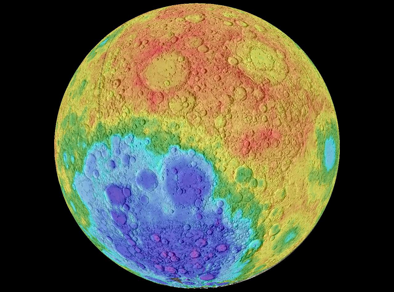
A hypsometric map uses contour lines to show variation in elevation of the terrain for a specific area. This is such a map showing elevation variations of the moon, using contour lines and shading.
A hypsometric map uses contour lines to show variation in elevation of the terrain for a specific area. This is such a map showing elevation variations of the moon, using contour lines and shading.
Cadastral Map
http://elcoco.co/new-cadastral-maps-provide-better-security-for-property-in-costa-rica/
A cadastral map is one that shows the boundaries and ownership of land in a given area. Here is an example of such a map for an area in Costa Rica.
A cadastral map is one that shows the boundaries and ownership of land in a given area. Here is an example of such a map for an area in Costa Rica.
Windrose Map
http://www.climate.washington.edu/climate.html
Here is an example of a windrose map, which shows wind speed and direction for a particular area (in this case Spokane, WA). Windroses were precursors to the compass rose we typically see on maps.
Here is an example of a windrose map, which shows wind speed and direction for a particular area (in this case Spokane, WA). Windroses were precursors to the compass rose we typically see on maps.
Isogonic Map
http://gly.fsu.edu/~kish/field/projects/p4/D2.htm
An isogonic map uses contour lines to show variations in the Earth's magnetic field for a region. This map shows this for the globe from 1995.
An isogonic map uses contour lines to show variations in the Earth's magnetic field for a region. This map shows this for the globe from 1995.
Isothermal Map
http://pequotlakes.k12.mn.us/index.cfm?pageid=8270
This is an example of an isothermal map, which uses contour lines to show variations in temperature. This specific map uses contour lines and color shading to show variations in temperature in the U.S.
This is an example of an isothermal map, which uses contour lines to show variations in temperature. This specific map uses contour lines and color shading to show variations in temperature in the U.S.
Isoplethic Map
http://dwb4.unl.edu/chem/chem869v/chem869vlinks/weather.about.com/newsissues/weather/library/weekly/aa071600a.htm
An isoplethic map uses contour lines to show some variable which cannot be measured at a point, but which instead must be calculated from data collected over an area. This specific map shows Hydrogen ion concentration as pH in the US for 1998.
An isoplethic map uses contour lines to show some variable which cannot be measured at a point, but which instead must be calculated from data collected over an area. This specific map shows Hydrogen ion concentration as pH in the US for 1998.
Isopach Map
http://earthguide.ucsd.edu/eoc/teachers/t_tectonics/p_crust.html
Here is an example of an isopach map, which makes use of contour lines to show variations in thickness in the Earth's surface as this map illustrates.
Here is an example of an isopach map, which makes use of contour lines to show variations in thickness in the Earth's surface as this map illustrates.
Isohyet Map
http://www.environment.gov.au/soe/2001/publications/technical/wind-erosion/index.html
This is an isohyet map, which uses contour lines to show precipitation levels. This specific map is of Australia and shows rainfall amounts.
This is an isohyet map, which uses contour lines to show precipitation levels. This specific map is of Australia and shows rainfall amounts.
Isotach Map
http://stresscretegroup.com/technical-resources/wind-maps/american-isotach-wind-map.asp
This is an isotach map, which shows wind speeds using contour lines. This specific map shows wind speeds in the U.S.
This is an isotach map, which shows wind speeds using contour lines. This specific map shows wind speeds in the U.S.
Isobar Map
http://hellonewzealand.blogspot.com/2010/07/wind-gales-and-storms.html
This is an isobar map, which shows areas of high and low air pressure using contour lines. This specific map is of New Zealand and shows areas of high and low pressure, as well wind direction.
This is an isobar map, which shows areas of high and low air pressure using contour lines. This specific map is of New Zealand and shows areas of high and low pressure, as well wind direction.
Monday, July 2, 2012
Continuously Variable Proportional Cirlce Map
http://www.guardian.co.uk/news/datablog/2009/apr/13/week
This is an example of a continuously variable proportional circle map of unemployment in the US from 2007 to 2009. It is a proportional circle map because the circle sizes are proportional to the the data being showing; however it uses a scale and is not range graded.
This is an example of a continuously variable proportional circle map of unemployment in the US from 2007 to 2009. It is a proportional circle map because the circle sizes are proportional to the the data being showing; however it uses a scale and is not range graded.
Proportional Circle Map
http://www.google.com/imgres?num=10&hl=en&biw=1680&bih=947&tbm=isch&tbnid=vbuEm_NTl-pcmM:&imgrefurl=http://personal.frostburg.edu/sbriggs0/maps.htm&docid=4YkMQvduLRs2vM&imgurl=http://personal.frostburg.edu/sbriggs0/USA_GradCirclefinal.jpg&w=1650&h=1275&ei=hVTyT97iHob69QT-u6mHAg&zoom=1&iact=rc&dur=438&sig=113213532916660177585&sqi=2&page=1&tbnh=140&tbnw=181&start=0&ndsp=40&ved=1t:429,r:8,s:0,i:98&tx=124&ty=64
This is a proportional circle map, where the circle sizes are proportional to the the data being showing; in this case, Walmart stores in the US in 2009
This is a proportional circle map, where the circle sizes are proportional to the the data being showing; in this case, Walmart stores in the US in 2009
Range Graded Proportional Circle Map
http://www.google.com/imgres?imgurl=http://www.geog.ucsb.edu/~jeff/gis/proportional_symbols_files/map1.jpg&imgrefurl=http://www.geog.ucsb.edu/~jeff/gis/proportional_symbols.html&h=509&w=396&sz=84&tbnid=hRwwhBLHD16pAM:&tbnh=131&tbnw=102&prev=/images%3Fq%3Dproportional%2Bcircle%2Bmaps&zoom=1&q=proportional+circle+maps&usg=__3p4c22ApAUilEk6Q_6lGqqw9kqE=&sa=X&ei=6YXvTIydKMWqlAfWmdGgDQ&ved=0CCAQ9QEwAw
This is an example of range graded proportional circle map of internet usage in Europe in 2004. It is a proportional circle map because the circle sizes are proportional to the the data being showing; it is range graded because only a certain number of circle sizes are used.
This is an example of range graded proportional circle map of internet usage in Europe in 2004. It is a proportional circle map because the circle sizes are proportional to the the data being showing; it is range graded because only a certain number of circle sizes are used.
Choropleth Map
http://www.bestcountryreports.com/Population_Map_China.php
This is a choropleth map, which uses color and shading to show a specific variable; in this case China's population.
This is a choropleth map, which uses color and shading to show a specific variable; in this case China's population.
Thematic Map
http://www.icsm.gov.au/mapping/maps_thematic.html
Here is a thematic map, showing the maritime zones of Australia. Thematic maps show a specific theme as related to a geographic area.
Here is a thematic map, showing the maritime zones of Australia. Thematic maps show a specific theme as related to a geographic area.
Planimetric Map
http://www.google.com/imgres?start=144&num=10&hl=en&biw=1680&bih=947&addh=36&tbm=isch&tbnid=VDah4uQDmj-K6M:&imgrefurl=http://www.stockmapagency.com/Political_Map_Bolivia_Provinces_C-Boli-2007-Pol2.php&docid=OFshwHeDOGxXdM&imgurl=http://www.stockmapagency.com/media/Country/Modern/T_Bolivi_Pol2.jpg&w=250&h=321&ei=OFHyT-izO42E8ATbhJiXDQ&zoom=1&iact=hc&vpx=314&vpy=549&dur=2235&hovh=254&hovw=198&tx=129&ty=130&sig=113213532916660177585&page=4&tbnh=143&tbnw=109&ndsp=54&ved=1t:429,r:45,s:144,i:311
This is a planimetric map of Bolivia, showing the provinces and country borders as well as cities and other features. Unlike a topographic map which shows features in the vertical, this map only shows features in the horizontal.
Topographic Map
http://www.google.com/imgres?num=10&hl=en&biw=1680&bih=947&tbm=isch&tbnid=Yx9Wl-enFKjHhM:&imgrefurl=http://www.vidiani.com/%3Fp%3D3533&docid=zxJn1qbhGfgW3M&imgurl=http://www.vidiani.com/maps/maps_of_asia/maps_of_india/detailed_topographical_map_of_india.jpg&w=750&h=777&ei=8U7yT72XOISE8QSIp_21DQ&zoom=1&iact=hc&vpx=944&vpy=134&dur=4475&hovh=229&hovw=221&tx=94&ty=133&sig=113213532916660177585&sqi=2&page=1&tbnh=139&tbnw=134&start=0&ndsp=45&ved=1t:429,r:5,s:0,i:88
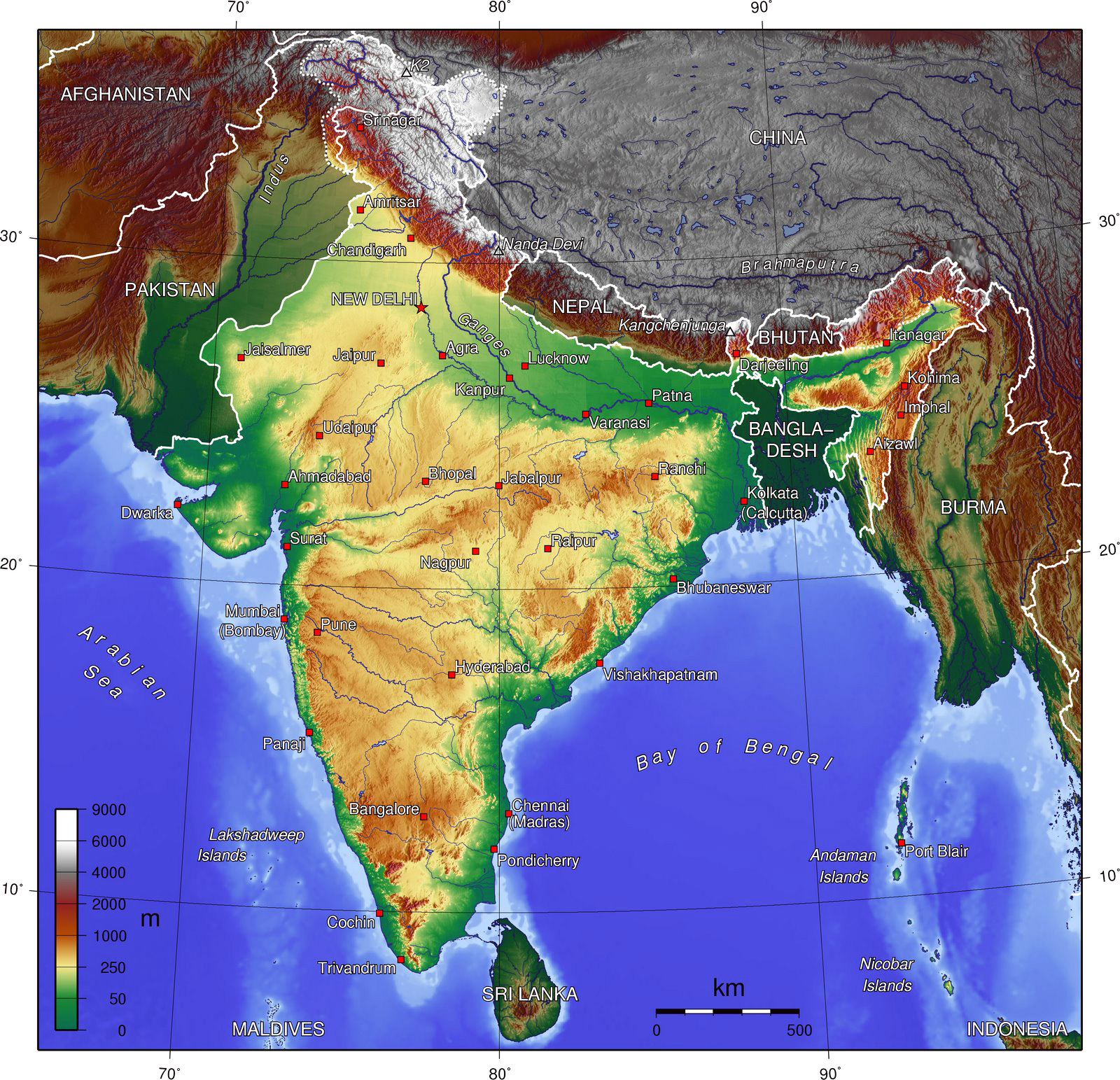
This is a topographic map of India, showing the landscape and natural physical features of India (elevation, mountains, rivers etc) as well as man-made features such as cities.
This is a topographic map of India, showing the landscape and natural physical features of India (elevation, mountains, rivers etc) as well as man-made features such as cities.
LIDAR Map
http://www.google.com/imgres?hl=en&biw=1680&bih=947&tbm=isch&tbnid=piJMuN9X0xzn0M:&imgrefurl=http://www.noaanews.noaa.gov/stories/s798.htm&docid=0etJ7XKrMBzbsM&imgurl=http://www.noaanews.noaa.gov/stories/images/manhattan-lidar092701.jpg&w=3764&h=2056&ei=m03yT5j2GYay8AS8hJyAAg&zoom=1&iact=hc&vpx=817&vpy=477&dur=3320&hovh=166&hovw=304&tx=112&ty=95&sig=113213532916660177585&page=1&tbnh=112&tbnw=205&start=0&ndsp=40&ved=1t:429,r:20,s:0,i:137
This is a LIDAR map of lower Manhattan from September of 2001 after 9/11. It uses light (laser pulses), instead of radio or microwave radiation that is used with radar, to map an area.
This is a LIDAR map of lower Manhattan from September of 2001 after 9/11. It uses light (laser pulses), instead of radio or microwave radiation that is used with radar, to map an area.
Dot Distribution Map
http://www.google.com/imgres?start=0&num=10&hl=en&biw=1680&bih=947&tbm=isch&tbnid=dB7tLkHH1BsN7M:&imgrefurl=http://www.bbc.co.uk/scotland/learning/bitesize/standard/geography/population/distribution_density_rev1.shtml&docid=xXYikrJDWdoNfM&imgurl=http://www.bbc.co.uk/scotland/learning/bitesize/standard/geography/images/g155.gif&w=546&h=290&ei=JUvyT5LyJZOQ8wSXuK2HAg&zoom=1&iact=hc&vpx=1331&vpy=474&dur=461&hovh=163&hovw=308&tx=141&ty=71&sig=113213532916660177585&page=1&tbnh=99&tbnw=187&ndsp=41&ved=1t:429,r:24,s:0,i:24
This is an example of dot distribution map, showing frequency in an area...in this case, world population. One date equals 100,000 people.
This is an example of dot distribution map, showing frequency in an area...in this case, world population. One date equals 100,000 people.
Isoline Map
http://www.google.com/imgres?start=42&num=10&hl=en&biw=1680&bih=947&tbm=isch&tbnid=A2n04ahg_CWizM:&imgrefurl=http://famous1.all.co.uk/key/isolines%2520atlas&docid=OmkxsFZESwIXnM&imgurl=http://geography.uoregon.edu/envchange/clim_animations/gifs/netrad_web.gif&w=674&h=457&ei=pknyT47qIob89QT45OyDDQ&zoom=1&iact=rc&dur=303&sig=113213532916660177585&page=2&tbnh=130&tbnw=192&ndsp=49&ved=1t:429,r:33,s:42,i:186&tx=41&ty=62
This is an example of a isoline map, using contour or isolines to show certain data distribution; in this case, net radiation levels.
This is an example of a isoline map, using contour or isolines to show certain data distribution; in this case, net radiation levels.
Infrared Aerial Photo
http://www.google.com/imgres?start=0&num=10&hl=en&biw=1680&bih=947&tbm=isch&tbnid=mbi0MuWE1LIdvM:&imgrefurl=http://www.sciencephoto.com/media/179411/view&docid=ZK4-BHN-P4wXWM&imgurl=http://www.sciencephoto.com/image/179411/350wm/E7700321-Infrared_aerial_photo_showing_vegetation_patterns-SPL.jpg&w=350&h=322&ei=8EfyT4WsM4Gq8AThpJyZDQ&zoom=1&iact=hc&vpx=603&vpy=612&dur=680&hovh=190&hovw=207&tx=95&ty=134&sig=113213532916660177585&page=1&tbnh=147&tbnw=160&ndsp=42&ved=1t:429,r:27,s:0,i:37
Here is an example of infrared aerial photo which shows vegetation patterns using film sensitive to infrared wavelengths, making it more pronounced than it would be with a black and white aerial photo.
Here is an example of infrared aerial photo which shows vegetation patterns using film sensitive to infrared wavelengths, making it more pronounced than it would be with a black and white aerial photo.
Mental Map
http://www.google.com/imgres?num=10&hl=en&biw=1680&bih=947&tbm=isch&tbnid=R8WcHbewu53W9M:&imgrefurl=http://andrewshears.com/2010/12/19/mapping-geo-autobiography-my-mental-map-of-the-world/&docid=R4MKio5Z_rA84M&imgurl=http://andrewshears.com/wp-content/uploads/2010/12/mydrawtheworld.jpg&w=3000&h=1449&ei=TkXyT7S6H4r89QSuqYSwDQ&zoom=1&iact=rc&dur=415&sig=113213532916660177585&sqi=2&page=1&tbnh=89&tbnw=184&start=0&ndsp=39&ved=1t:429,r:1,s:0,i:76&tx=100&ty=41
This is an example of a mental map of the world. It is abstract and not factual accurate since it based on an individual's perspective and world view, which is what makes it a mental map.
This is an example of a mental map of the world. It is abstract and not factual accurate since it based on an individual's perspective and world view, which is what makes it a mental map.
Black & White Aerial Photo
http://home.comcast.net/~dondraughon/fsu-48.htm
This is a black & white aerial photograph of Florida State University campus from 1948.
This is a black & white aerial photograph of Florida State University campus from 1948.
Sonar Map
http://www.google.com/imgres?um=1&hl=en&biw=1680&bih=947&tbm=isch&tbnid=gKRSgO0gEJEulM:&imgrefurl=http://www.sciencephoto.com/media/127557/enlarge&docid=M4agIBGWSa7KnM&imgurl=http://www.sciencephoto.com/image/127557/large/C0064442-West_Mata_underwater_volcano,_sonar_map-SPL.jpg&w=530&h=368&ei=tUHyT8rMCI3-8ATHlsGSAg&zoom=1&iact=hc&vpx=178&vpy=618&dur=4066&hovh=187&hovw=270&tx=156&ty=95&sig=113213532916660177585&page=1&tbnh=128&tbnw=185&start=0&ndsp=41&ved=1t:429,r:25,s:0,i:153
This is an example of a Sonar map of the West Mata underwater volcano in the Pacific Ocean. It is an example of a sonar map because it uses the transmission of sound waves through water to provide a picture of this volcano and its' size.
This is an example of a Sonar map of the West Mata underwater volcano in the Pacific Ocean. It is an example of a sonar map because it uses the transmission of sound waves through water to provide a picture of this volcano and its' size.
Doppler Radar Map
http://www.google.com/imgres?hl=en&biw=1680&bih=947&tbm=isch&tbnid=9n7R90xlpozMYM:&imgrefurl=http://www.atmos.washington.edu/~cliff/Langleyradar.html&docid=2v_ZFgB38lPwzM&imgurl=http://www.atmos.washington.edu/~cliff/Katrina-radar-29th-715253.jpg&w=400&h=342&ei=Yj3yT8zgDIH-8ATxzdmRAg&zoom=1&iact=hc&vpx=691&vpy=144&dur=6956&hovh=208&hovw=243&tx=147&ty=138&sig=113213532916660177585&page=1&tbnh=134&tbnw=157&start=0&ndsp=40&ved=1t:429,r:3,s:0,i:82
This is an example of a Doppler radar of Hurricane Katrina that hit New Orleans in August of 2005. The reason this is an example of Doppler radar is because it uses microwave radiation and a directional antenna to receive and measure the time of arrival of reflected pulses from distant objects. In this case it to break through cloud cover and provide detailed information in regards to the hurricanes location, direction, strength, etc.
This is an example of a Doppler radar of Hurricane Katrina that hit New Orleans in August of 2005. The reason this is an example of Doppler radar is because it uses microwave radiation and a directional antenna to receive and measure the time of arrival of reflected pulses from distant objects. In this case it to break through cloud cover and provide detailed information in regards to the hurricanes location, direction, strength, etc.
Subscribe to:
Comments (Atom)


