Map Catalog Blog

Sunday, July 22, 2012

Scatterplot Map

http://www.stat.yale.edu/Courses/1997-98/101/scatter.htm
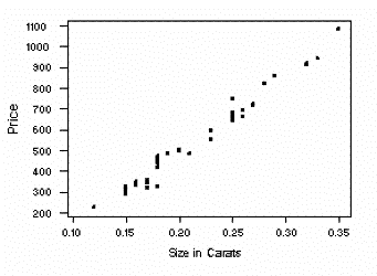
A scatterplot is graphical representation which uses the Cartesian coordinate system to show two sets of variables.  Here is an example of such showing the size of diamonds in carats and their price.
Posted by RSBlue22 at 3:28 PM
Email ThisBlogThis!Share to XShare to FacebookShare to Pinterest

No comments:

Post a Comment

Newer Post Older Post Home
Subscribe to: Post Comments (Atom)

Blog Archive

  • ▼  2012 (50)
    • ▼  July (50)
      • Classed Choropleth Map
      • Lorenz Curve Graph Map
      • Bilateral Graph Map
      • Population Profile Map
      • Scatterplot Map
      • Index Value Plot Map
      • Correlation Matrix Map
      • Similarity Matrix Map
      • Parallel Coordinate Graph Map
      • Triangular Plot Map
      • Climograph Map
      • Histogram Map
      • Box Plot Map
      • Stem and Leaf Plot Map
      • Star Plot Map
      • Statistical Map
      • Cartographic Animation Map
      • Cartogram Map
      • Flow Map
      • Propaganda Map
      • DOQQ Map
      • DEM Map
      • DLG Map
      • DRG Map
      • PLSS Map
      • Hypsometric Map
      • Cadastral Map
      • Windrose Map
      • Isogonic Map
      • Isothermal Map
      • Isoplethic Map
      • Isopach Map
      • Isohyet Map
      • Isotach Map
      • Isobar Map
      • Continuously Variable Proportional Cirlce Map
      • Proportional Circle Map
      • Range Graded Proportional Circle Map
      • Choropleth Map
      • Thematic Map
      • Planimetric Map
      • Topographic Map
      • LIDAR Map
      • Dot Distribution Map
      • Isoline Map
      • Infrared Aerial Photo
      • Mental Map
      • Black & White Aerial Photo
      • Sonar Map
      • Doppler Radar Map

About Me

RSBlue22
View my complete profile
Awesome Inc. theme. Powered by Blogger.